
Excel comes with several data analysis tools, formulas, and representation tools as well such as tables, charts, etc. One such feature is a histogram that helps in assessing the frequency of an outcome in a particular data set (also referred to as a bin). But for that, you need to know how to make a histogram in excel.
Large piles of data do seem overwhelming to make an analysis. This becomes a tedious and painstaking task which is the reason one must learn how to create a histogram in excel. It not only helps get a pictorial representation but is profoundly used for drawing comparisons at a glance.
A histogram is a statistical representation that highlights the frequency (occurrence) of a specific outcome (in the form of value) in different bins. Bins are the values that formulate bars for different data sets. The values in bins must be arranged in ascending order. A histogram can help you understand the trends if you wish to see a diagrammatic representation of the age of your clients. It makes understanding the data patterns as easy as pie.
How To Make A Histogram In Excel?
Broadly speaking, there are three ways to make a histogram in excel:
- Using Frequency Function
- Using Insert Chart Option
- Using Data Analysis ToolPak
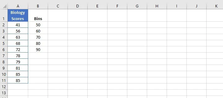
Let’s discuss them one at a time. We will have to take a data set for this purpose. For instance, we’ll take these biology scores and bins data to proceed with.
How To Make A Histogram In Excel Using The Frequency Function
The reason we’re discussing this method first is its compatibility and dynamic nature. To be more precise, a histogram created by the frequency function will show the result of any modifications made to the data values even after its creation.
SYNTAX:
=Frequency(data_array, bins_array)
(i) Here, Data Array refers to the data, and
(ii) Bins Array refers to the range mentioned above.
- Firstly, in the column next to bins, type FREQUENCY as the heading and press the ‘Enter Key.’
- After that, drag the cursor down to the adjacent last value of the bins cell and type =frequency(. Then select the data range column (only for values), insert a comma “,” and select the range of the bin (only for values). Lastly, press Ctrl+Shift+Enter. Here is how it has to be done:
- Then select the data and go to the ‘Insert’ tab.
- Now in the ‘Charts’ section, go to the ‘Columns’ option and click on the very first chart type in the 2D Model. This will generate a histogram.
- In the ‘Chart Tools’ section, one can select the chart design and layout and format it for colour, borders, etc. You can also add a chart title, insert gridlines and define the axes as well.
You’ve just learned how to make a histogram in excel using the frequency function. If this is clear, then you’ll easily understand how to make a histogram in excel using the Insert Chart option.
How To Make A Histogram In Excel Insert Chart Option
A histogram generated using the ‘Insert Chart’ option too is dynamic, i.e., it’ll get modified if any alterations are made to the data.
- Select the data range for which you want to make the histogram.
- Go to the ‘Insert’ tab. Now in the ‘Charts’ section, go to the ‘Columns’ option and click on the very first chart type in the 2D Model.
- In the ‘Chart Tools’ section, one can select the chart design and layout and format it for colour, borders, etc. You can also add a chart title, insert gridlines and define the axes as well.
How To Make A Histogram In Excel Using Data Analysis ToolPak
To create a histogram using the Data Analysis ToolPak, you need to install it. Worry not because you don’t need to purchase any additional software for this. In fact, it is one among advanced excel add-ins which is in-built into the excel sheet but is just required to be activated.
Data Analysis ToolPak option has to be activated in the following: Excel 2007, Excel 2010, Excel 2013, Excel 2016, Excel 2019, Excel for Mac 2011, Excel for Mac 2016, Excel for Mac 2019, Excel for Mac 2021, Excel for Microsoft 365 & Excel for Microsoft 365 Mac. Follow the below stated steps to create a histogram in Excel using the Data Analysis ToolPak in Windows:
- When you are on your excel sheet, hover over to the ‘Data’ tab.
- If you don’t see the ‘Data Analysis ToolPak’ option, then go to the File tab or Office button. Click the ‘Excel Options’ tab/button.
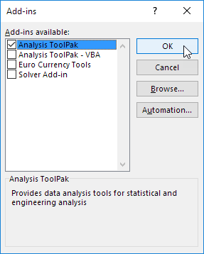
- Click on the ‘Add-Ins’ option and then click on the ‘Analysis ToolPak’ option.
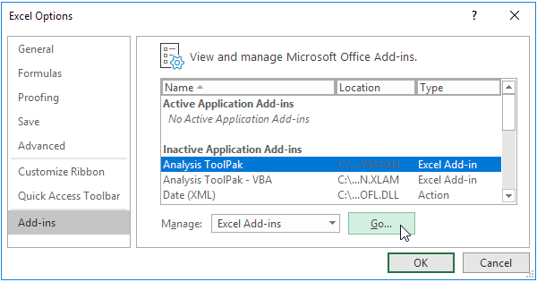
- Locate and click the ‘Go’ tab/button at the bottom.
- A new dialog box will open up before you; just check/tick the box next to the ‘Analysis ToolPak’ option. Click ‘OK.’
- Another dialog box will open up on your screen. Click on ‘Yes.’ Now you can check if this add-in is activated or not by going to the ‘Data Tab.’ The add-in will appear at the top left corner.
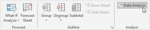
- Now let’s proceed to draw the histogram. Click on the ‘Data Analysis’ option in the ‘Data’ tab.
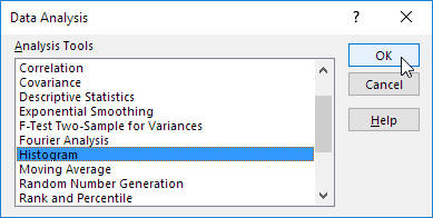
- A pop-up box will appear right on your screen. Locate the ‘Histogram’ option and click on ‘OK.’
- Once again, you’ll see a new box on your screen. Place the cursor in the empty box in front of the Input Range and select the data range. So basically, your input range is your data range.
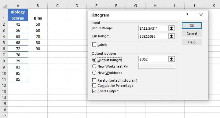
- Then place the cursor before the Bins Range and select the range of the bin. As you’ll do so, the cell range will get fixed with the cell address in the box.
- Now in the Output Options, click on the circle next to the Output Range.
- The next step is to place the cursor right before the Output Range. Here you need to provide the cell address where you wish to generate the histogram on your excel sheet. Simply click on an empty cell, and it’ll take the cell address automatically.
- Then check/tick the box next to ‘Chart Output’ and click ‘OK.’
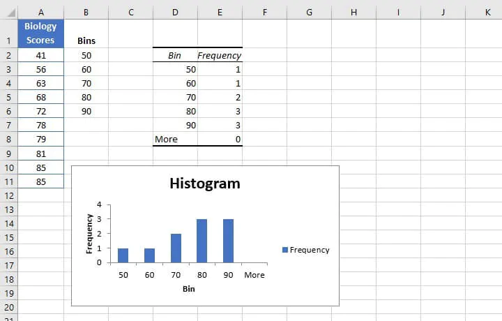
- Once the command is given, a histogram altogether with a table showing bins and frequency will be produced on your excel sheet.
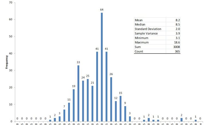
It must be noted that any value exceeding the maximum bin range will be shown by the ‘More’ bar.
The histogram will represent the frequency of the ages in the bars. Understand it this way, the scores between 0 to 50 will be shown on the X axis while the Y axis represents the number of scores falling in that range. That’s why it is 1 for 0 to 50 because only 43 falls into that range, and 3 for 71 to 80 because 72, 78 & 79 falls into that range.
Follow the below stated steps to create a histogram in Excel using the Data Analysis ToolPak in Mac:
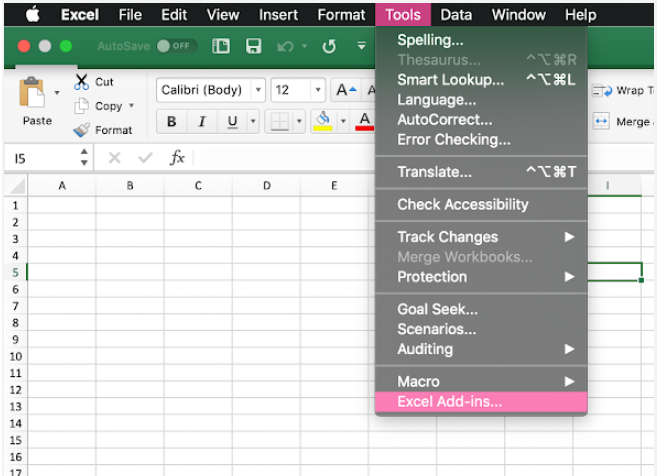
- While on your excel sheet, head to the ‘Tools,’ then locate and click on the ‘Excel Add-Ins.’
- Once the dialog box appears, select ‘Analysis ToolPak,’ and click ‘OK’.
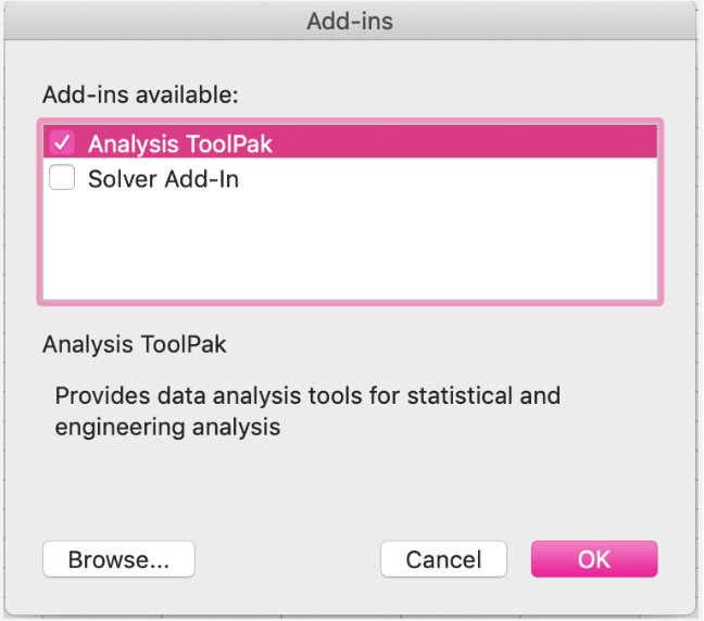
NOTE: In case the option isn’t available, browse and install it, then restart your mac.
- Now let’s proceed to draw the histogram. Click on the ‘Data Analysis’ option in the ‘Data’ tab.
- A pop-up box will appear right on your screen. Locate the ‘Histogram’ option and click on ‘OK.’
- Once again, you’ll see a new box on your screen. Place the cursor in the empty box in front of the Input Range and select the data range. So basically, your input range is your data range.
- Then place the cursor before the Bins Range and select the range of the bin. As you’ll do so, the cell range will get fixed with the cell address in the box.
- Now in the Output Options, click on the circle next to the Output Range.
- The next step is to place the cursor right before the Output Range. Here you need to provide the cell address where you wish to generate the histogram on your excel sheet. Simply click on an empty cell, and it’ll take the cell address automatically.
- Then check/tick the box next to ‘Chart Output’ and click ‘OK.’
- Once the command is given, a histogram altogether with a table showing bins and frequency will be produced on your excel sheet.
NOTE: Any alterations made to the original data will not affect the produced histogram and table. This implies that a new histogram must be created for new values. In contrast, if you manually change any value in the produced table, it’ll affect the histogram.
This was all about how to make a histogram in excel. Now let’s see a few ways to customize it.
Customize Your Histogram
So far, we’ve discussed distinct methods for how to make a histogram in excel. But to give the histogram an overall relevance with your data and for better representation, it might need some customizations. That’s exactly what we’ll discuss now:
- How To Add Elements In Histogram Excel?
Assign chart title, affix axis names, add data labels, add gridlines and alter axes to make the histogram more informational. Select the histogram, then check the options available under Labels in Layout. Or, click on the green plus sign on the histogram to view options.
- How To Remove Gap Between Bins?
Click on the bins generated in the histogram. Then right-click and select ‘Format Data Series.’ Set the Gap Width to 0 and close the tab. You’ll see all your bins will be placed together.
Excel proffers several formulas and functions that will make data analysis easy-peasy. Otherwise, one will surely go down for the count dissecting huge data piles. That’s why learning how to make a histogram in excel can be your saviour in presentations. The above article has enlisted three ways to create a histogram in excel. Moreover, for working around large data sets, you must know how to find duplicates in excel.