

Google has been introducing new standards for website owners for a couple of years. The aim of such standards is to improve the user experience while roaming on a website, like a fast and reliable web hosting solution to ensure maximum uptime of the website, on-page and off-page SEO, and many others.mobile friendly website
One of the most important aspect Google considers while ranking a website is its mobile-friendliness. According to a report, over 50% of the internet users use internet through mobile devices, that means half of your website visitors may access your website through different mobile devices. So, to get a higher rank on Google and other Search Engines, your website must be responsive to different mobile devices.

Although, they were penalizing not mobile-friendly websites and rewarding the mobile-friendly ones since April 2015 but in March 2018, Google said in an official announcement that they will be indexing websites that are based on their mobile versions. Not only Google, but Bing has also announced officially that they will consider mobile-friendly websites to rank. The reason is that desktops are decreasing with the passage of time and the users are making a large number of searches through mobile devices. Let’s have a look at some more interesting statistics below:
1
- On the first page of Google, 70% of the websites were mobile friendly.
- The websites that switched from not mobile-friendly to mobile-friendly, witnessed an increase of 1750% in their conversion rate.
- In a survey, 72% of the people accepted that they are appealed to mobile-friendly websites.
- 77% of the adults own a smartphone.
- Of all the internet access, about 60% is done through mobile devices.
- Surprisingly, 94% of all the mobile visitors, judge a website on its responsiveness.
- More than half of the total revenue generated by e-commerce comes from mobile.
Well, we have talked about responsive or mobile-friendly websites and given some statistics, do you know what a mobile friendly is? Let us explain.
What is a mobile-friendly website?
Google considers a website mobile-friendly if it has the following characteristics.
- Adjustment of the content automatically so the visitors don’t have to zoom in their screen or rotate their mobile phones.
- The text should easily be read without zooming in.
- Placement of links in a fair distance, so the users don’t click on the wrong links unintentionally.
- The website MUST not use any uncommon software that is rarely found on a device.
There are several other reasons why your website should be mobile-friendly. Let’s explore them all.
Improved User Experience:
Have you ever been to a website on mobile that is unorganized? If yes, there are chances that you haven’t visited that website again because of the first worst experience. You may lose a potential customer just because of a non-mobile friendly website. According to a report published in March 2018, from February 2017 to February 2018, 60% of the mobile users faced problems while browsing non-mobile friendly websites and they never went back to that website again.
Fast Speed
Along with a reliable web hosting solution, the mobile-friendly behavior of the website is also necessary to load faster. If the website is not optimized for the mobile devices, it will load all the images and content in its original size that affects the website loading speed badly.
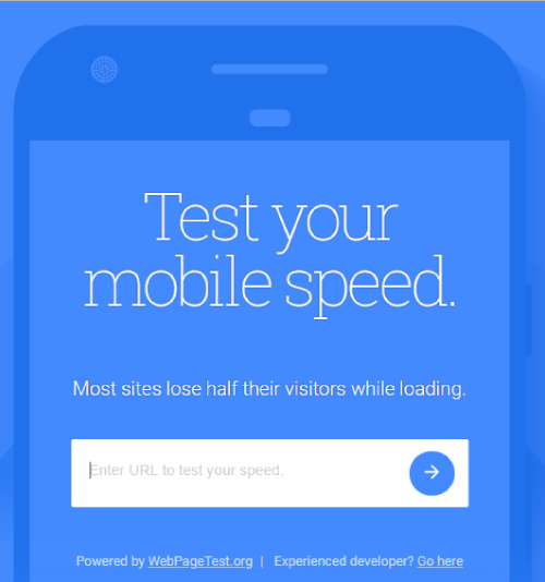
You can try below link for speed test of your web page.
- https://tools.pingdom.com/
- https://testmysite.thinkwithgoogle.com/
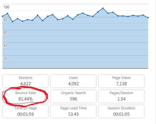
Decreased Bounce Rate
It is really very important for your website that the users stay on it for fairly a long time that may lead to a conversion, and that is only possible if your website is when your website is mobile friendly and can be navigated easily on all types of mobile devices. So, increased average time on a website means increased conversion of visitors into customers.
Mobile shopping is the Future
Not only an ordinary website or blog but also the e-commerce websites should consider this seriously. As we have already mentioned some statistics, the majority of the users use mobile phones to visit the websites. On Black Friday 2014, for the first time, the mobile internet traffic exceeded PC internet traffic that means the shoppers considering mobile visits.
Conversion rates of desktop websites are really very low as compared to the mobile websites. So, it is the best time to convert your desktop website to a mobile-friendly website.
Higher Rank on Google and Bing
The search engines give more value to mobile-friendly websites and they get higher ranks on search engines. The search engines like the giant Google and Bing are always increasing their standards and release updates on a weekly or monthly basis. You can use a Serp API to scrape search engine results pages and check how your website increases in rankings as you optimize for mobile devices.

Increase in Social Media shares
As the majority of users use mobile phones to visit websites and spend a lot of time on social networks Facebook, Instagram, Youtube, Printerest Ect. The ratio of social media shares through mobile phones is also in a larger number.
How to check whether your website is mobile friendly or not?
There are several methods to check your website’s behavior for mobile devices.
Google Mobile-Friendly Test
Using this tool, you can check within seconds whether your website is mobile friendly or not. Its very importance of mobile-friendly website checking by online. You just have to visit this website for Mobile-Friendly Test, enter your website’s URL and click on “Run Test”, and you’ll get a professional analysis after some moments. Google mobile-friendly test other error will shown in the result. You have to fix it as soon.
If google mobile friendly test not working please visite here to get help.
Google Webmaster Tools
To get more detailed insights about your website’s response to mobile devices, Google Webmaster Tools gives you more options to analyze your website.
The Quickest Method
Follow the steps to check your website’s mobile view.
- Open your website on a Browser.
- Grab your browser’s right side using the mouse and drag it to the leftmost side.
- If you are still able to browse your website without any hassle and all the content of the website is re-adjusted accordingly, your website is good to go. If not, you should be converting it into a mobile-friendly version.
Final Words
So, we hope that you have learned that what is a mobile-friendly website and why do you need it? Consider converting your desktop website into mobile-friendly one as soon as possible or say bye to higher ranks on Google and Bing as well as to your customers as they won’t be interested in wasting their time in an unorganized website.